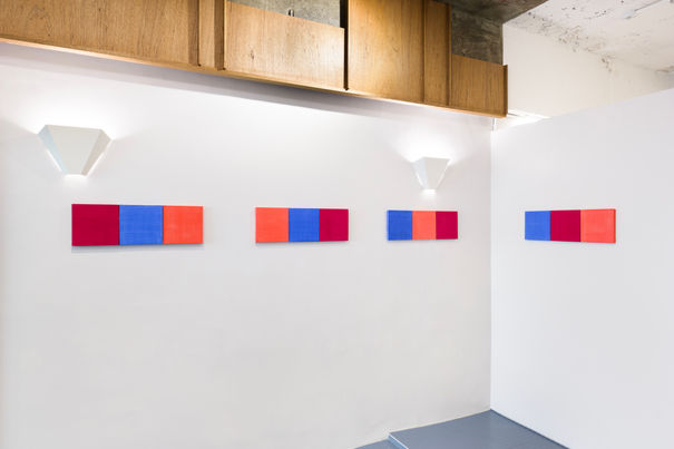
멜로디 박은 색을 완결이나 경계에 갇히지 않는 순수한 형식이자 매체로 바라보며, 색을 통해 언어로 명명되지 않는 감각과 정의하기 어려운 시간을 탐구한다.
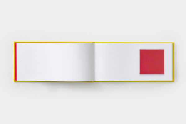
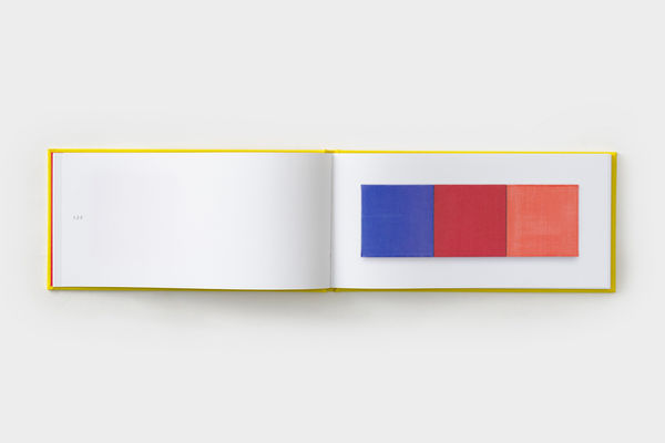
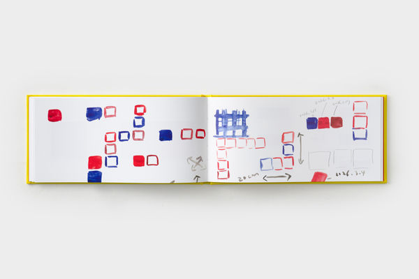
『1 2 3』은 포켓테일즈가 멜로디 박 개인전 《1 2 3》에 맞춰 출간한 도록이다. 〈1,2,3〉 시리즈는 멜로디 박이 2016년부터 지속해 온 색으로 기록한 일기 〈diary〉에서 출발한다. 이 작업은 동일한 크기의 세 가지 색을 하나의 유닛으로 묶고, 연속적인 배열을 통해 고정되지 않는 색의 본질을 탐구한다. 특히 〈1,2,3〉이 색의 배열을 통해 구조를 만들어 가는 방식은 〈diary〉에서 색으로 기록한 시간을 고정되지 않고 축적되며 재배열될 수 있는 구조로 바라보게 한다. 또한 이 책에는 작가의 작업 세계 전반을 살펴볼 수 있는 인터뷰가 담겨 있다.
Q&A with Melody Park
Q. <1,2,3>이라는 개념은 어떻게 시작되었나요? 색이 셋이 모여야 비로소 하나의 관계가 성립한다고 보신 계기가 궁금합니다.
A. 두 개의 색이 만날 때는 단순한 대비나 대립에 그칠 수도 있고, 그 자체로 하나의 짝(pair)이 되어 분리할 수 없는 한 덩어리로 인식될 수도 있다고 생각합니다. 세 가지 색이 모이면 색과 색 사이에 또 다른 색이 위치하며 그 관계가 훨씬 입체적으로 확장됩니다. 네 가지 이상의 색의 관계는 지나치게 복잡하기에, 세 가지 색의 조합이 가장 적절한 조건이라고 판단했습니다. 같은 세 가지 색이라도 배치하는 순서, 색과 색 사이에 두는 간격과 공간적 관계에 따라 서로에게 미치는 영향과 지각적 경험은 달라집니다. 저는 이러한 차이를 나란히 배치하여 연속적으로 비교해 보고 싶었습니다. 색은 주변 조건과 상호작용에 따라 무수한 해석이 가능합니다. 작업 <1,2,3>은 색이 가진 다층적인 면을 저의 문법으로 탐구하는 시도입니다.
Q. 2016년부터 이어온 <diary> 작업에서 <1,2,3>으로 넘어오게 된 구체적인 지점은 무엇인가요? 두 작업은 어떻게 다르고, 어떻게 이어지나요?
A: <diary>가 '색은 시간을 기록하는 단위가 될 수 있을까?'라는 질문에서 출발해 시간과 색을 함께 탐구하는 작업이라면, <1,2,3>은 색 자체의 상호작용을 다루는 리서치입니다. 두 작업은 접근 방식이 다르지만 모두 색을 매개로 연구한다는 공통점을 지닙니다. <1,2,3>은 동일한 크기로 색을 아카이빙해 온 <diary>의 포맷에서 출발해, 색 자체의 다층적인 면을 집중적으로 탐구합니다. 여기에 사용된 세 가지 색은 모두 <diary>에 축적해 온 색으로, <1,2,3> 작업을 위해 선별해 다시 만들었습니다. 또한 <1,2,3>에서 색의 배열을 통해 구조를 만들어 가는 방식은, 그날의 날짜를 동일한 크기의 캔버스에 색으로 기록해 온 <diary>도 다양하게 배치해 보며, 시간을 선형적인 흐름이 아닌 축적되고 재배열될 수 있는 구조로 다시 바라보게 합니다. 두 작업은 서로 확장될 가능성을 열어 둡니다.
2016년에 시작한 <diary>가 올해로 딱 10년이 되었습니다. 지난 10년 동안 작업실 곳곳에는 20×20cm 크기에 칠해진 단색 작업들이 무작위로 놓여 있었습니다. 이 <diary> 작업은 시간을 기록하는 하나의 단위이기도 했지만, 색 그 자체로서 작업실 안 여기저기에서 다른 작업을 위한 바탕이 되어 주기도 하고, 서로 조합해 보고 나열해 보며 제가 앞으로 나아갈 작업의 방향을 가늠해 보기도 하는 일종의 지표 역할도 해 왔습니다. 그러다 어느 날 우연히 인터넷에서 일본의 색채를 체계화한 와다 산조(Wada Sanzo)의 아름다운 『배색사전』 오리지널 레어북을 보게 되었고, 그 책에 대해 조사해 보니 한국에서도 보급판을 쉽게 구할 수 있어 바로 사려고 검색해 봤는데, 이미 제가 가지고 있는 책이었습니다. 와다 산조의 배색 연구를 다시 들여다보니, 제가 평소 작업실에서 <diary> 작업을 가지고 색을 실험하는 방식과 닮아 있었습니다. 『배색사전』의 형식에서 다시 한번 깨달음을 얻어, 제가 생각하는 색의 기본 개념을 풀어 보면 어떨까 싶어 <1,2,3> 작업을 만들게 되었습니다.
Q. 색을 전(前)인지적이고 전(前)언어적인 힘이라 규정하시면서도, 정작 작업은 숫자(1,2,3)와 날짜라는 언어적·기호적 체계로 이름 붙이고 정리되어 있습니다. 언어 이전의 감각을 언어적 체계 안에 담아내는 이 역설을 작가님은 어떻게 받아들이고 계신가요?
A. 우선 <diary> 연작은 색을 숫자나 날짜로 규정하기 위한 작업이 아닙니다. 발터 벤야민(Walter Benjamin)이 말했듯 색은 완결이나 경계가 없는 순수한 형태이자 매체입니다. 저는 객관적이지도 주관적이지도 않은 이 '색'이라는 영역이, 미스터리한 주제이지만 삶 자체인 '시간'이라는 본질을 기록하는 단위가 될 수 있는지 탐구해 왔습니다. 시간과 색 모두 관념의 틀에 가두기 어렵기에, 색이 제 시간을 기록할 수 있는 또 하나의 단위가 될 수 있다고 생각하기 때문입니다. 또한 이번 연작에 쓰인 ‘1, 2, 3’이라는 숫자는 색에 특정한 의미나 이름을 부여하는 '언어적 명명'이 아닙니다. 그것은 단지 세 가지 색의 배치, 순서, 그리고 공백이 이루는 '구조'를 가리키는 최소한의 기호일 뿐입니다.
︎
더 자세한 인터뷰 내용은 전시와 함께 제작된 아트북 『1 2 3』에서 이어집니다.


Melody Park regards colour as a pure form and medium that is neither closed off nor bounded. Through colour, she explores sensations that cannot be named in language and time that cannot be defined.
『1 2 3』 is a book published by pockettales(Seoul) to accompany Melody Park’s solo exhibition 《1 2 3》. The 1,2,3 series originates from diary, a diary project Park has pursued since 2016, recording her days through colour. This project explores the unfixed essence of colour by grouping three colours of identical size into a single unit and arranging them in a continuous sequence. In particular, the way 1,2,3 builds a structure through the arrangement of colours invites us to view the time recorded through colour in diary not as something fixed but as a structure that can accumulate and be rearranged. The book also includes an interview that offers a look at the artist’s practice as a whole.
Q&A with Melody Park
Q. How did the concept of 1, 2, 3 begin? I'm curious what led you to see three colors, specifically, as the point where a relationship first comes into being.
A. When two colors meet, I think their relationship can remain one of simple contrast or tension, or they can come to be perceived as an inseparable pair. When three colors come together, however, a third color enters into the relationship between the other two, making the relationships among them far more dimensional and layered. With four or more colors, these relationships become overly complex, so I came to see three colors as offering the most appropriate conditions for this exploration.
Even with the same three colors, the way they affect one another—and the way we experience them—changes according to their order, the distance between them, and their spatial relationships. I wanted to place these differences side by side and compare them within a continuous sequence. Color can be read in endlessly different ways depending on its surroundings and its interactions with other colors. 1, 2, 3 is my attempt to explore the multiple layers of color through a visual grammar of my own.
Q. What specifically led you from diary, which you've continued since 2016, into 1, 2, 3? How do the two differ, and how are they linked?
A. diary begins with the question, “Can color become a unit for recording time?” and explores time and color together, while 1, 2, 3 is research into the interactions of color itself. The two works take different approaches, but they both use color as a medium for research. 1, 2, 3 starts from the format of diary, in which colors have been archived at a consistent size, and focuses on the multilayered nature of color itself. The three colors used here were all selected from those accumulated in diary and remade specifically for this work. Additionally, the way 1, 2, 3 builds structure through the arrangement of color leads me to try arranging diary in various ways, with each date recorded in color on a canvas of the same size. In doing so, I reconsider time not as a linear progression but as a structure that can be accumulated and rearranged. The two works thus remain open to the possibility of expanding in relation to one another.
diary, which I started in 2016, just turned ten this year. Over the past decade, 20×20cm monochrome pieces were randomly placed throughout my studio. diary has been a unit for recording time, but the colors themselves have also become a foundation for other works. I would combine and arrange them in different ways, using them as a kind of index for considering where my work might go next. Then one day I happened to come across a rare original copy of Sanzo Wada's A Dictionary of Color Combinations online–a beautiful book that systematically documented Japanese color combinations. I looked into it, found that the widely available edition was easy to get in Korea, went to order a copy right away, and realized I already owned it. Looking again at Wada’s research on color combinations, I realized how closely it resembled the way I had been experimenting with color through diary in my studio. Revisiting the format of A Dictionary of Color Combinations, I began to wonder how I might express my own basic ideas about color. This became the starting point for 1, 2, 3.
Q. You define color as a pre-cognitive, pre-linguistic force, and yet your work is named and organized through the linguistic, symbolic systems of numbers (1, 2, 3) and dates. How do you make sense of that paradox: holding a sense that precedes language inside a system that is itself linguistic?
A. First off, diary isn't a work meant to pin color down through numbers or dates. As Walter Benjamin put it, color is a pure form and medium with no completion or boundary. What I've been exploring is whether this thing we call “color,” neither fully objective nor fully subjective, can become a unit for recording the essence of “time,” something mysterious but also life itself. Both time and color resist being boxed into a concept, and that's exactly why I think color can be another unit for recording my own time.
And the numbers “1, 2, 3” in this series aren't a form of “linguistic naming” that assigns a specific meaning or name to the colors. They're simply minimal signs pointing to the “structure” formed by arrangement, sequence, and the empty space between the three colors.
︎
The full interview continues in 1 2 3, the art book published on the occasion of the exhibition.